
Application to Track Waiting Times and Availability of Places in New York City
ROLE
User Research
Product Design
Usability Testing
TIMELINE
12 weeks, Sept - Dec 2023
TYPE
Student Team Project
TOOLS
Figma

Project Overview

‘NYQueue’ was designed to provide a friendly and reliable platform for newcomers and locals to view real-time waiting times and availability for restaurants, museums, and attractions in New York City. Currently, there is no product available in NYC that allows users to avoid the time-consuming and costly implications of traveling to a place only to find it is crowded, which leads to an unfulfilling experience. To improve this experience we have conducted user research and usability testing to identify users’ expectations and make active improvements based on quantitative and qualitative data.
THE CHALLENGE
NYC is too Crowded!!

goals 🎯

To provide a friendly and reliable platform for newcomers and locals to view real-time waiting times and availability for restaurants, museums, and attractions in New York City.

To avoid time consuming and cost implications of traveling to visit a new place by allowing people to know beforehand where they could access faster.

To generate a fulfilling experience of New York City to fast paced visitors and locals.

Attempt to balance and disperse the amount of people visiting different restaurants, attractions, and museums in New York City.

Let's walk you through  

User Research📚
Interview📋
Persona👩
User Flow🌟
Moodboards🌼
Concept✨
User Research📚
Interview📋
Persona 👩
User Flow🌟
Moodboards🌼
Concept✨
Ideation💡
Sketch✏️
Wireframe💻
UI Design🖌️
Prototype📱
Design System🎨
User Testing📎
Final Product🎉
User Research📚
Interview📋
Persona👩
User Flow🌟
Moodboards🌼
RESEARCH
In this user research protocol, we want to dig deeper into understanding our users, cultivate a strong sense of empathy, and answer our objectives. To achieve this, we conducted research interview and competitive review.
6
Participants
3
Researcher
30
min Interview
01

06+

"Sometimes we do need to plan
out our day and we need to find
ways to organize our time better."
"I usually assume if the place is gonna be busy by the day
and time."

What they Say

"Planning is much easier if I'm the person visiting alone."
"The concept of being able to view times beforehand is helpful."
"I really look forward to finding information I can trust."

SOLUTIONS

Smart Queue Management

Overcoming the challenges of overcrowded tourist attractions, wasted time, and complex transportation can significantly improve the overall visitor experience.

Information and Planning Support

Incorporating features such as map views with distances, filtering options, and operating hours can empower users to plan effectively and make informed decisions.

Accessibility, Cost, and Safety

Emphasizing safety measures and considering cost implications, offering real-time ticket availability and pricing information allows tourists to plan and budget effectively, avoiding unexpected expenses.

IDEATION
In the ideation stage, I will walk you through where innovative concepts take shape, encompassing screen sketches, wireframes, and user flow diagrams. This preliminary exploration precedes our transition to the design phase.
02

SKETCHES

SKETCHES

USER FLOW
DIAGRAM
Joining Queue / Making a Reservation
This flow shows the steps of joining the queue and making a reservation by exploring places in categories, selecting places, and filling in information for the booking.

WIREFRAME

WIREFRAME

WIREFRAME

WIREFRAMEdio

WIREFRAME

WIREFRAME

WIREFRAME

WIREFRAME

Creative studio

03
DESIGN
This section presents the design systems encompassing typography and color schemes, UI components, and a high-fidelity prototype for the NYQueue application.
Design
Systems
✱ ✱ ✱ ✱ ✱ ✱ ✱ ✱ ✱ ✱ ✱ ✱ ✱ ✱ ✱ ✱ ✱ ✱ ✱
✱ ✱ ✱ ✱ ✱ ✱ ✱ ✱ ✱ ✱ ✱ ✱ ✱ ✱ ✱ ✱ ✱ ✱ ✱
✱ ✱ ✱ ✱ ✱ ✱ ✱ ✱ ✱ ✱ ✱ ✱ ✱ ✱ ✱ ✱ ✱ ✱ ✱
Home Screen
It represents what the user’s home page will look like once they’ve joined an online queue. At the top of the screen they will see a small box with their real-time status including: number in the line, amount of people joining and estimated waiting time.
Search Screen
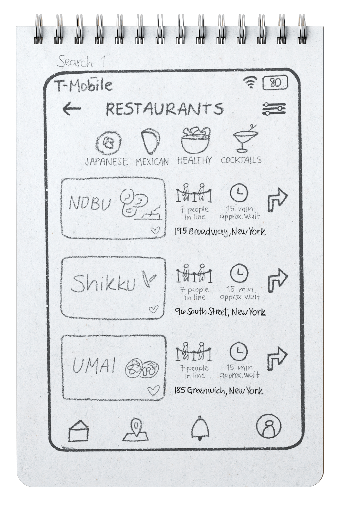
Once the user chooses one of the three categories of places, they will see scrollable subcategories. A filter option will also be available to narrow options. The restaurants' name will be displayed, along with the title, a photo, the address, the number of people currently waiting in line, the average waiting time, and an arrow to view more details. It will also be possible to ‘heart’ or ‘favorite’ any spot.
Filter Option Screen
A filter option will also be available to narrow options. Users can filter down  waiting time, people queueing, price, distance and dress code when exploring the places.
Restaurant
Details Screen
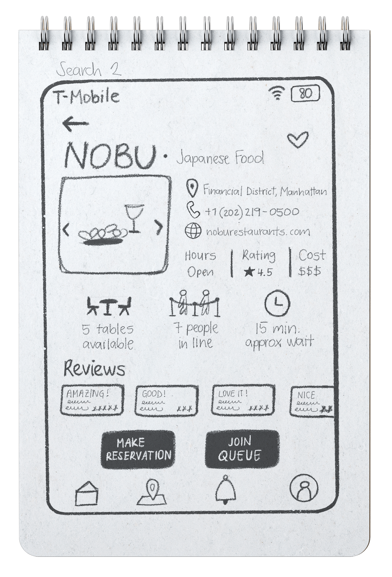
Once the user chooses a place, in this case a restaurant, they will be able to see all of the detailed information helpful for them to make a decision. Additionally, users will be able to specify the number of attendees and choose between making a reservation or joining the queue for a seamless experience.
Make Reservation Screen
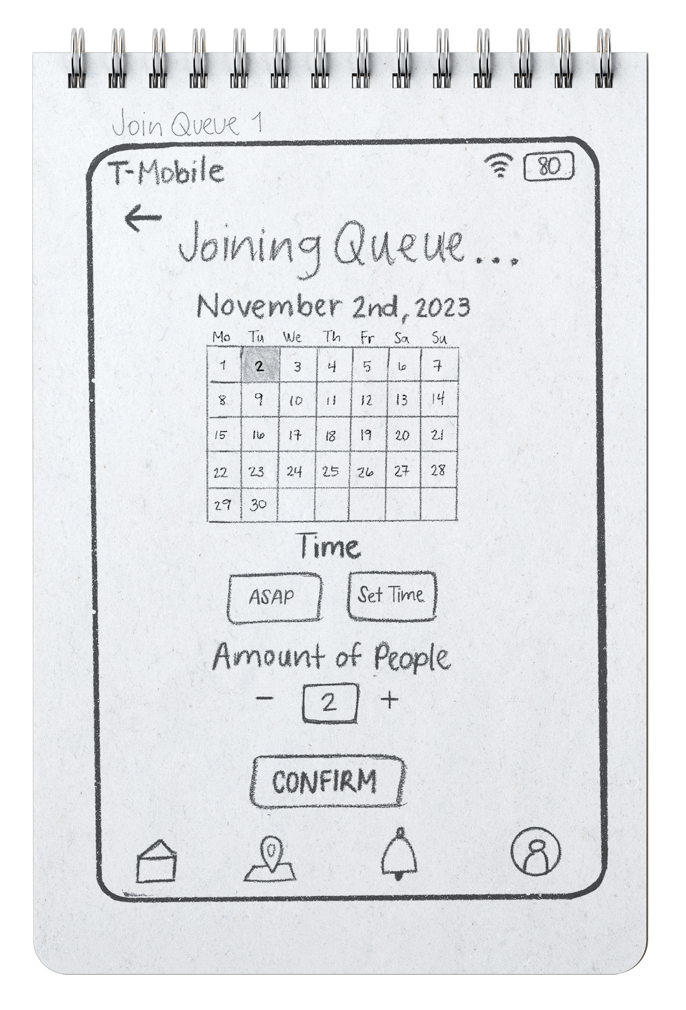
The screen typically has a clear title that informs the user about the action they are performing, including filling information of date and time for the desired restaurant. The final element consists of a user confirmation button that allows them to submit their inquiry.
Confirmation Screen
This screen displays a successful joining queue or making reservation, along with options to review, modify, or cancel the action. It also show real-time waiting time and informs users regarding their current status.
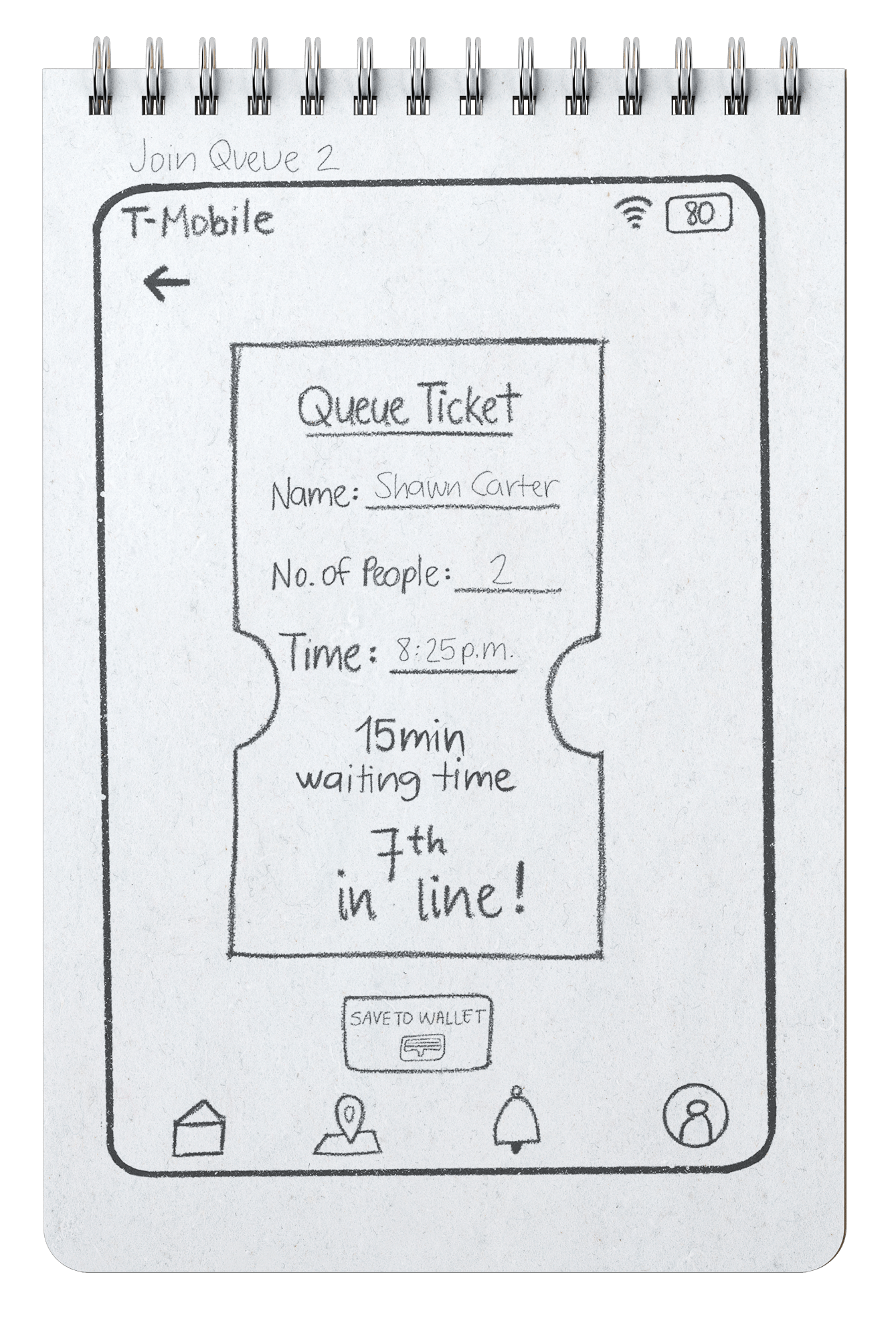
Queue ticket Screen
By swiping up, a queue ticket/reservation ticket is displayed as an acknowledgement of booking and a verification at the venue. The user also has the option to add the ticket to their wallet.
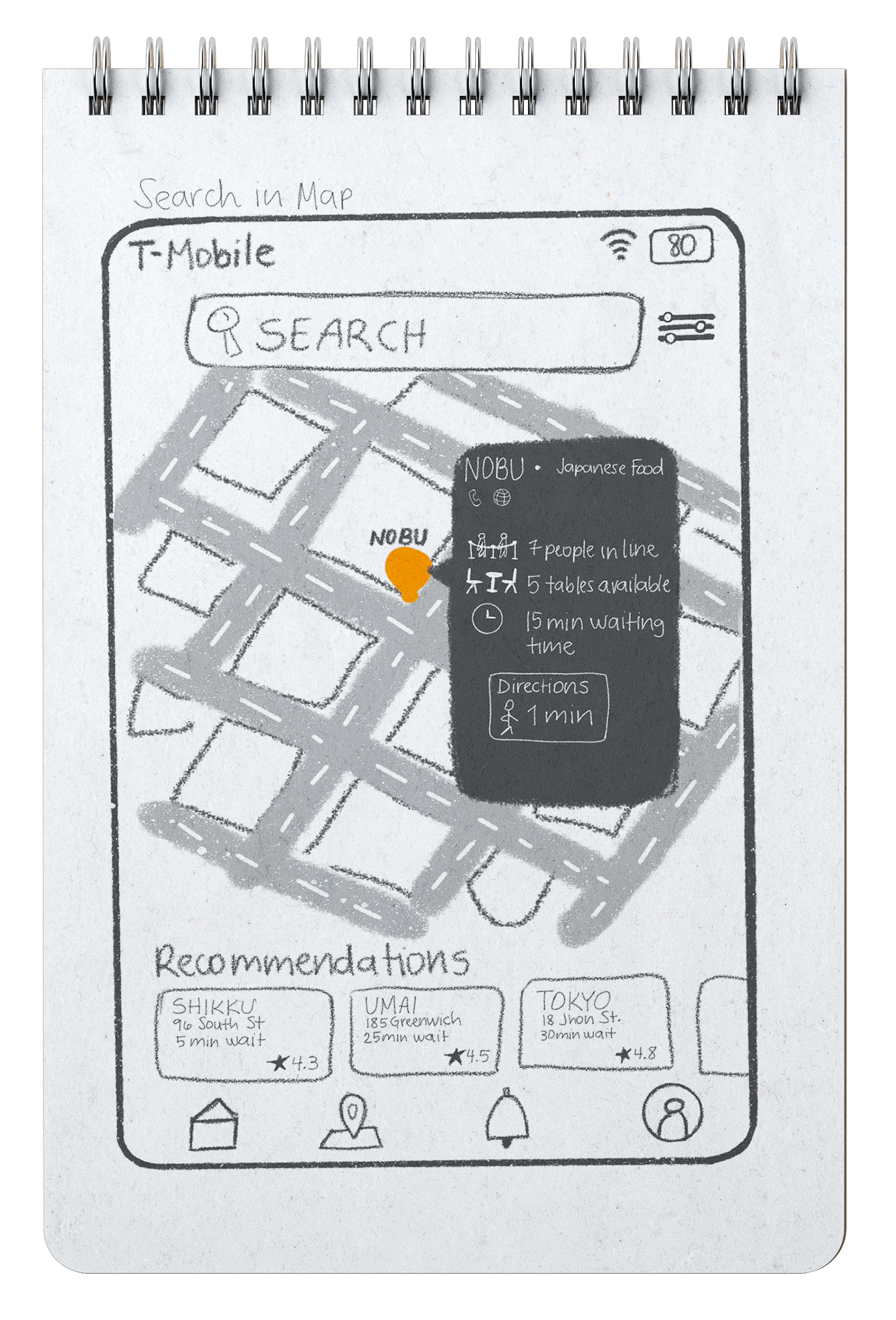
Search by Map Screen
On the map screen, users can navigate through a list of places that are provided based on their current geographical position and proximity. The search feature, along with filter also displayed on this screen for searching a particular place by entering keywords. Additionally, there are some recommended places displayed at the bottom of the screen.
NYQUEUE
PROTOTYPE
Onboarding
Upon launching the app, users are welcomed with an introductory screen that sets the stage for their experience. Following this warm welcome, users are guided through preference screens where they can select their favorite foods, museums, or tourist attractions. These preferences play a crucial role in tailoring the app's suggestions
Joining the online queue
Users have the choice to enter the virtual queue either by navigating through the home screen or the map screen and selecting the relevant option. This action places them in line to receive the service or attention they are seeking. Subsequent to joining the queue, users receive updates on their position and the estimated wait time, conveniently displayed on the home screen.
Make a Reservation
Users initiate the reservation process by accessing the dedicated reservation feature within the app. Users are prompted to select their preferred date and time for the reservation. After confirming the reservation details, users receive a reservation ticket.
Remove the queue
The process of removing oneself from a queue within an app is designed to provide users with the flexibility to reconsider or adjust their preferences. Users start by accessing through queue status on home screen. A confirmation prompt will be presented to ensure their decision to exit the queue.
04
USABILITY TESTING
In this section, we delve into the crucial aspect of usability testing. By analyzing quantifiable metrics derived from comprehensive usability testing across various tasks, we gain valuable insights into the effectiveness and user-friendliness of our design.
6
Users
3
Tasks
94%
Successful Rate
SUS Score

Improvement

Immediate Changes
✦       Remove dress code option from filter
✦       Change the color of ‘Remove from the queue’ button
✦       Label the filter icon
✦       Change the main category icons into a button-like design
✦      Add personalized option before joining the queue E.g. a note for a specific table preference
✦     Adding what is accepted in the place. E.g. Pet friendly
Future Changes
✦       International expansion
✦       Language options for foreigners
✦       In-app pay bills
✦       In-app special offers
Final Prototype

Reflection 🎉

🩵 Skill Development
The project provided a platform for refining technical skills by navigating challenges such as user research, human-centered design thinking, design implementation, and usability testing. Additionally, it underscored the importance of honing interpersonal and communication skills essential for effective teamwork and project collaboration.

🤍 Feedback Significance
Regular feedback from both peers and instructors played a crucial role in refining the application. Embracing a mindset of continuous improvement allowed us to iterate on our design and implementation, ensuring that the final product met or exceeded expectations.

💜 Understanding User Needs
Designing an application to track waiting times and availability required a deep understanding of user needs and preferences. Conducting surveys, interviews, and usability testing helped us tailor the app to meet the specific requirements of potential users in a dynamic urban environment.
THANK YOU
Claudia
UX Design    ✦    Product design    ✦    Graphic design    ✦    digital marketing     ✦    UX Design    ✦    Product design    ✦    Graphic design    ✦    digital marketing

Home

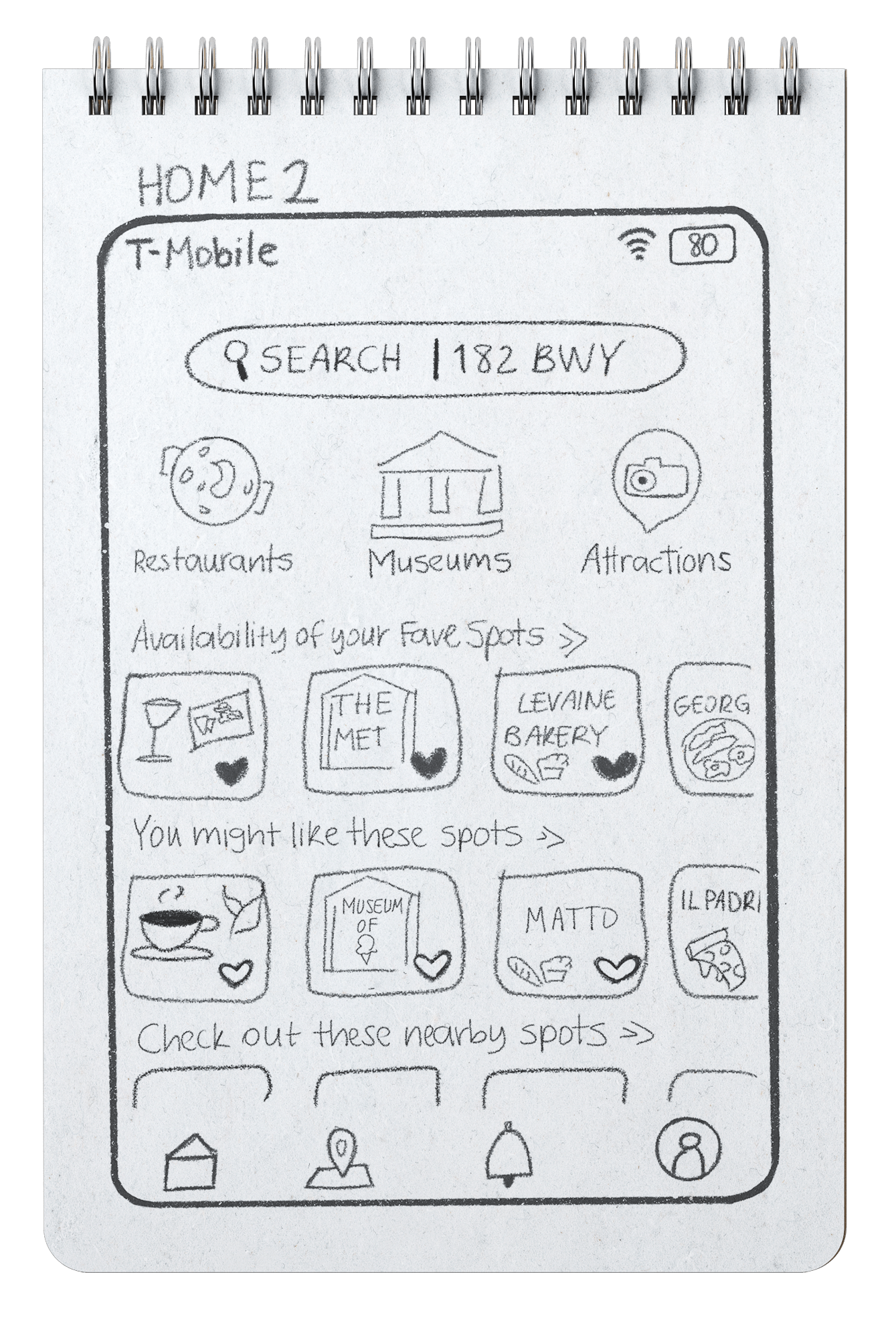
Home Screen represents what the user’s home page will look like when they open the app for the first time. They will be able to see a Search bar and their location. There will be different categories of places to visit, favorite spots and suggestion of spots based on preferences..

Search Screen

The search screen shows scrollable subcategories along with the list of places. A filter option will also be available to narrow the options.

Restaurant Detail

Once the user chooses a place, in this case a restaurant, they will be able to see all of the detailed information helpful for them to make a decision.

Joining Queue

The screen typically has a clear title that informs the user about the action they are performing, including filling information of date and time for the desired restaurant and specifying the number of attendees.

Confirmation

This screen displays a successful queue join, along with options to review, modify, or cancel the action. It also show real-time waiting time and informs users regarding their current status.

Queue Ticket

By swiping up, a queue ticket is displayed as an acknowledgement of booking and a verification at the venue. The user also has the option to add the ticket to their wallet.

Search by Map

On the map screen, users can navigate through a list of places that are provided based on their current geographical position and proximity.